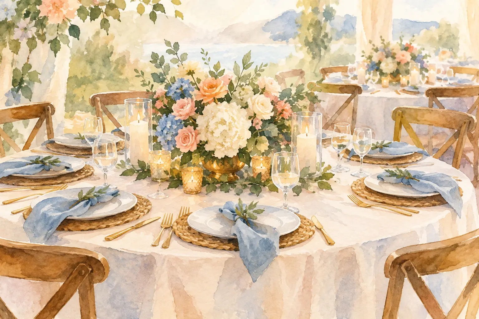
A beautiful reception table is rarely the result of one standout centerpiece. What makes tables look cohesive is the way every visible layer relates to the next: the linen beneath the place setting, the flowers beside the candles, the menu resting on the charger, and the colors repeated across the room. When those details share a clear visual direction, guests feel the atmosphere before they notice any single item.
For weddings and meaningful celebrations, cohesive table décor creates a sense of care. It gives a ballroom, tent, or family gathering space a finished look while leaving room for the people, traditions, and joyful conversation that make the event personal.
What Makes Tables Look Cohesive? A Clear Design Direction
Cohesion begins with one design idea that can guide each choice. That idea does not need to be complicated. It may be soft ivory and warm gold, romantic garden florals, clean white flowers with black accents, or rich jewel tones for a henna night or Eid celebration. The goal is not to make every piece identical. It is to make every piece feel as though it belongs in the same story.
A strong direction usually starts with a focused color palette. Choose a main color, one or two supporting tones, and a neutral that gives the eye a place to rest. For example, dusty blue linens, cream florals, and brushed gold candleholders create a different feeling than emerald runners, deep plum blooms, and antique brass details. Both can be elegant. What matters is carrying the chosen palette through the table rather than introducing unrelated colors at every layer.
Materials matter just as much as color. A matte ceramic charger, airy garden-style flowers, and soft linen napkins have a relaxed, organic feel. Mirrored bases, crystal vessels, polished flatware, and structured floral arrangements read more formal. Mixing materials can add dimension, but the finishes should feel intentional. Too many competing textures can make a table look assembled rather than styled.
Start With the Foundation: Linens and Table Shape
The table itself sets the stage. Round tables create a naturally centered composition, while long banquet tables invite a more continuous design that travels down the middle. Sweetheart tables, head tables, and family-style tables may need their own treatment, but they should still connect to the overall reception look.
Linens are often the largest field of color in the room, so they have an outsized effect on cohesion. A neutral floor-length linen can let floral color and candlelight take the lead. A colored or textured linen can make a statement, especially when paired with simpler place settings. Neither approach is automatically better. It depends on the room, the lighting, and how much visual movement is already present in the venue.
A common concern is whether every table must have the same linen. Not necessarily. A subtle mix can be lovely, such as specialty linens on a sweetheart table or alternating textures among guest tables. The connection comes from repetition: similar tones, compatible fabrics, or a shared accent color. Variation works best when it looks planned from across the room, not random up close.
Use Repetition Without Making Every Table Identical
Repetition is one of the quietest ways to make an event feel polished. Repeating the same flower varieties, candle colors, napkin tone, or metallic finish creates rhythm from table to table. Guests may not consciously identify the pattern, but they will see a room that feels settled and complete.
That does not mean every centerpiece should match exactly. In fact, alternating centerpiece heights or vessel styles can make a reception more interesting. One table might hold a low floral arrangement surrounded by votives, while the next features a taller arrangement in the same palette. The shared blooms, vessels, and candlelight keep the pair connected.
This approach is especially useful in larger spaces. A single centerpiece repeated on every table can feel flat, while too many unrelated designs can become visually busy. Two or three coordinating centerpiece styles usually offer enough variety while preserving the overall look.
Choose Centerpieces That Fit the Table and the Room
A centerpiece should be beautiful from every angle, but it also has a practical role: it must suit the size of the table and the room around it. A small arrangement on a large round table can appear lost. An oversized design on a narrow table can crowd place settings and interrupt conversation.
Scale is one of the most overlooked parts of cohesive event décor. Consider the ceiling height, table width, guest count, and surrounding focal points. Tall centerpieces can bring presence to a spacious ballroom, especially when they are balanced with low candlelight and floral accents below. Low centerpieces are inviting and intimate, but they need enough fullness to hold their own in the room.
For long tables, centerpieces often look best as a connected landscape rather than isolated arrangements. Floral clusters, candles, bud vases, and restrained greenery can create movement along the length of the table. The key is keeping the spacing deliberate. Empty gaps can make even beautiful pieces feel disconnected.
Let Place Settings Support the Décor
Place settings are smaller than centerpieces, yet they are the details guests see most closely. Chargers, napkins, menus, glassware, and flatware should support the main design rather than compete with it.
If the floral design is colorful and full, a classic place setting may provide needed balance. If the tablescape is intentionally minimal, a textured napkin, specialty charger, or elegant menu can add warmth and personality. One well-chosen detail often has more impact than several decorative additions placed together.
Napkins are particularly useful for tying a palette together. A soft sage napkin can echo greenery in the centerpieces. A deep burgundy napkin can ground blush and cream flowers. A neutral napkin with a refined fold can soften a more formal table. The choice should feel connected to the full tablescape, not simply picked because it is attractive on its own.
Create a Consistent Relationship Between Height and Light
Height brings energy to a room, while candlelight makes it feel inviting. When these elements are balanced across the tables, they create a cohesive visual rhythm.
A useful approach is to work in layers: a higher focal point, a middle layer of flowers or vessels, and a lower layer of candles or small accents. This prevents the centerpiece from feeling like one object placed in the center of a table. It also gives the design depth in photographs and in person.
Candlelight should be repeated with intention. A few candles at one table and none at another can make the room feel uneven. Matching votives, taper holders, or hurricanes can carry warmth throughout the reception. The exact candle style should reflect the setting. Clear glass may feel light and classic, while gold holders can add richness and depth.
Connect the Tables to the Rest of the Celebration
Tables do not exist separately from the room. A cohesive tablescape should speak to the ceremony flowers, welcome display, backdrop, stage, cake area, or other focal décor. This does not require matching every detail. It means repeating a few visual cues so guests experience one connected environment.
For example, the floral palette used in centerpieces may reappear in a backdrop installation. The same gold finish from the place settings may show up in candleholders near the cake display. At a cultural celebration, meaningful colors, fabrics, or ornamental details can be carried thoughtfully from the focal area to the guest tables without overwhelming the room.
The strongest designs know where to be expressive and where to be quiet. If a stage or backdrop is highly detailed, guest tables may need a more restrained interpretation of the same palette. If the tables are the main visual focus, surrounding décor can frame them with simpler, complementary elements.
Avoid the Details That Break Visual Flow
Even a lovely palette can lose its impact when each table introduces a different style. Mismatched metals, unrelated flower colors, too many signage styles, and several competing patterns can pull the eye in too many directions. The issue is not that these elements are unattractive. They simply need a shared purpose.
Another common challenge is treating each décor piece as a separate decision. A charger may look beautiful alone, a chair accent may look beautiful alone, and a centerpiece may look beautiful alone, but their combination needs to be considered together. Viewing sample pieces side by side before the event helps reveal whether the tones, scale, and finishes truly belong together.
Cohesion also leaves room for restraint. Not every table needs a runner, charger, menu, favor, napkin ring, multiple candle styles, and floral arrangement. A thoughtfully edited table often feels more elevated because the most meaningful details have space to be seen.
A cohesive table should feel welcoming, not overdesigned. When the colors, florals, linens, and finishing details work in quiet conversation, guests can settle into the beauty of the celebration and the moments being shared around the table.