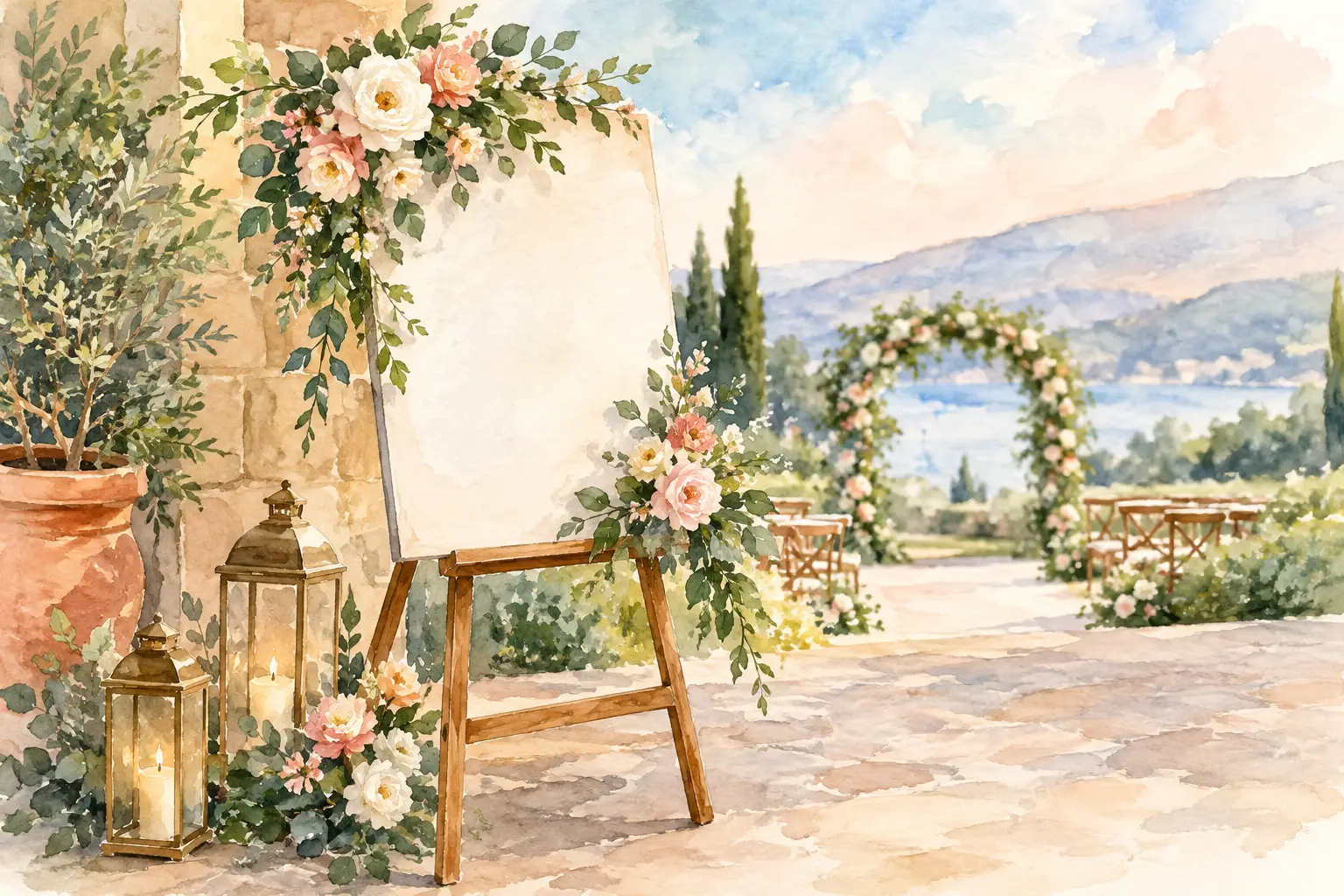
A welcome sign is often the first detail guests see after stepping into your celebration. Before they notice the flowers, the tables, or the backdrop, they are greeted by a message that sets the visual tone. Thoughtful wedding signage does more than share information. It introduces your style, helps guests feel comfortable, and gives the entire space a more finished, intentional look.
The most beautiful signs do not feel like separate pieces placed around the room at the last minute. They belong to the same visual story as the centerpieces, linens, florals, candles, and focal displays. Whether your wedding is soft and romantic, modern and minimal, richly layered, or inspired by meaningful cultural details, signage can quietly connect each part of the décor.
Start Wedding Signage With the Overall Look
It is tempting to choose signage by itself: a pretty acrylic welcome sign, a popular seating-chart style, or a phrase seen on social media. But a sign can look lovely on its own and still feel out of place in the room. The stronger approach is to begin with the atmosphere you want guests to experience.
Consider the colors already present in your décor. A ballroom with ivory draping, gold accents, and warm candlelight may call for elegant lettering on a soft neutral background, framed with florals that echo the arrangements nearby. A contemporary space with black details and clean table settings may feel more cohesive with clear acrylic, refined typography, and a restrained floral accent.
Materials matter as much as color. Acrylic can feel polished and modern. Wood adds warmth and texture. A mirror reflects light beautifully in an evening reception space, while fabric signage can soften a romantic or garden-inspired design. The best choice depends on the venue, the lighting, and the level of contrast needed for guests to read the sign easily.
When décor is layered with intention, signage becomes part of the design rather than an interruption to it.
Decide Which Signs Truly Serve Your Guests
Not every wedding needs every possible sign. Too many messages can make a room feel crowded, especially when tables, florals, and focal pieces are already visually detailed. Focus on the signs that are useful for your space and meaningful for your celebration.
A welcome sign is usually the natural starting point. It can include the couple’s names, wedding date, a short greeting, or a phrase that feels personal without competing with the design. Position it where guests can see it immediately, and treat the surrounding area as a small moment of décor. A floral arrangement, lanterns, candles, fabric draping, or a styled pedestal can make the entrance feel inviting.
A seating chart or escort-card display often carries the most practical information, so readability should come first. Guests should be able to find their names without standing too close or searching through overly decorative lettering. This does not mean the display must be plain. It simply means the design should balance beauty with clarity. Larger names, thoughtful spacing, and enough contrast between text and background make a real difference.
Other signs may support the guest experience at the ceremony, bar, card table, dessert display, or guest book. A signature drink sign can bring personality to the bar. A memorial sign can honor loved ones with sensitivity. A card-and-gift sign can make a functional area feel coordinated rather than overlooked. Choose these details based on the flow and feeling of your event, not because they appear on a standard checklist.
Make Readability Part of the Design
Wedding signs are decorative, but they also need to work. A beautiful script may look graceful in a photograph, yet become difficult to read from a few feet away. This is especially important for seating charts, menus, directional signs, and any sign guests need to reference quickly.
Use decorative lettering for names, headings, or a brief phrase, then pair it with a simpler font for details. Dark lettering on a light background is usually easy to read, while white lettering can be striking on a deep color or mirror. If using clear acrylic, think about what will sit behind it. Busy wallpaper, patterned drapery, or a colorful wall can make text disappear.
Scale is another detail that deserves attention. A sign that feels substantial in a studio can look small in a grand venue entrance. Conversely, an oversized display can overwhelm an intimate space. Consider the height of the room, the width of the entryway, and the distance from which guests will view the sign.
Lighting should not be an afterthought. Soft candlelight creates a beautiful mood, but it may not be enough for guests to read a dark seating chart later in the evening. A well-placed spotlight, nearby lamp, or brighter ambient area can preserve both the atmosphere and the sign’s purpose.
Create a Visual Thread From Ceremony to Reception
The most memorable wedding spaces feel connected even when the ceremony and reception take place in separate rooms. Signage can help carry your design language from one setting to the next.
For example, the welcome sign might feature an ivory background, gold lettering, and a garden-inspired floral accent. That same palette can appear in the ceremony reserved-seat signs, the reception seating display, and the table numbers. The repetition does not need to be exact. A small echo of the same floral color, frame finish, or typography is enough to make the experience feel considered.
Table numbers deserve the same attention. They are small, but they sit at the center of each guest table alongside the centerpiece and place settings. A delicate table number can complement low floral arrangements and candles, while a taller design may be better suited to elevated centerpieces. The goal is not to make every table identical. It is to ensure the sign belongs within the arrangement without blocking conversation or competing with the flowers.
For couples celebrating a Sudanese, Arab, or other culturally meaningful wedding tradition, signage can also offer a respectful way to include language, family names, motifs, or welcoming phrases that feel authentic to the celebration. The right approach depends on the couple’s preferences and traditions. These details are most meaningful when they are chosen personally, not added as decoration without context.
Give Signage Its Own Styled Moment
A sign resting alone against a wall can communicate the message, but it may not carry the same visual impact as a thoughtfully styled display. Consider where each major sign lives within the room and what will surround it.
At the entrance, a welcome sign may sit on an easel beside florals that reflect the ceremony or reception arrangements. At the seating-chart area, fabric, candles, greenery, or a tailored backdrop can turn a practical guest stop into a photo-worthy focal point. The styling should support the sign, not hide it. If the floral arrangement is too full or the backdrop too busy, the message can get lost.
This is where scale and proportion are especially important. A large sign often needs a substantial base or backdrop so it does not feel isolated. A petite sign may need a small arrangement or layered styling element to keep it from disappearing in a larger room. In either case, leave enough open space for the lettering to remain the focus.
Avoid the Details That Make Signs Feel Disconnected
A few common choices can weaken an otherwise beautiful design. Mixing several unrelated fonts, finishes, or colors can make signage look collected rather than coordinated. Choosing every sign in a different style may seem playful, but it can pull attention away from the overall décor.
Another concern is overfilling the space with wording. Guests do not need a long paragraph at every station. Short, warm language often has more impact, particularly when it is paired with thoughtful styling. A simple welcome, a clear instruction, or a meaningful phrase can say enough.
Finally, do not overlook placement. Keep signs out of narrow walkways, away from areas where doors will block them, and at a height guests can comfortably read. Functional details can still be beautiful when they are considered as part of the room from the beginning.
For weddings throughout Greater Boston and the South Shore, the venue itself can shape these decisions. Historic halls, waterfront settings, modern event spaces, and intimate banquet rooms each call for a different balance of material, scale, and styling. A sign should feel at home in its setting while still reflecting the couple behind the celebration.
At Sue’s Elegant Events, we believe the details guests may only notice for a moment can still shape how the entire room feels. Let your wedding signage welcome people warmly, guide them gracefully, and reflect the beauty of everything gathered around it.