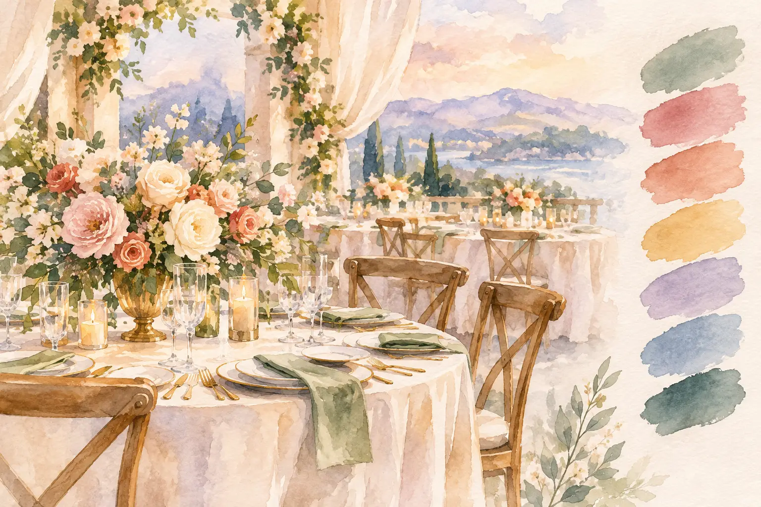
A reception can feel completely transformed by one well-chosen color moment: the soft glow of candlelight against plum linens, a warm ivory table layered with espresso details, or a bright floral centerpiece that gives a neutral room its personality. The most inspiring reception color trends 2026 are not about following one exact palette. They are about using color with more intention, depth, and contrast.
For weddings and meaningful celebrations, the goal is a room that feels coordinated from the guest tables to the focal backdrop, while still feeling personal to the people gathering there. In 2026, expect to see classic wedding colors used in richer, more layered ways.
Reception Color Trends 2026: Warm Neutrals With Depth
White, ivory, champagne, and beige remain timeless choices for reception décor, but flat neutral rooms are giving way to warmer combinations. Think creamy ivory paired with taupe, sand, caramel, mushroom, or soft mocha. These shades create a calm, welcoming foundation while allowing florals, candles, chargers, and linens to carry visual texture.
This approach works especially well for couples who want an elegant reception without a stark all-white appearance. An ivory linen may be complemented by gold flatware, textured napkins, warm glass candleholders, and floral arrangements with blush, beige, and muted brown tones. The result is refined, but it feels lived-in rather than overly formal.
The trade-off is that warm neutrals need contrast. Without it, tables can fade into one another, particularly in ballrooms with beige carpeting or warm walls. A darker napkin, a smoked-glass votive, or a deeper bloom in the centerpiece gives the design definition.
Berry, Wine, and Fig Tones Take Center Stage
Deep berry shades are one of the most versatile color directions for receptions in 2026. Burgundy, blackberry, merlot, aubergine, and fig bring richness to tables without making the entire room feel dark. Used thoughtfully, they look beautiful in every season, from a fall wedding to a winter celebration or a romantic spring evening reception.
Rather than covering every table in a bold linen, many designs use these colors as accents. A neutral tablecloth with wine-colored napkins, tapered candles, floral ribbons, or a few deeper blooms can create a dramatic effect while keeping the room light. For a more immersive look, velvet-like plum linens and layered floral centerpieces can make a larger reception feel intimate and intentional.
Berry tones pair especially well with soft blush, dusty rose, mauve, warm ivory, and antique gold. They also complement cultural celebrations where color may carry family significance or reflect the richness of traditional attire. The most successful design begins with the colors that matter to the hosts, then builds a palette that feels harmonious in the space.
A note on lighting and darker colors
Deep colors photograph beautifully, but they respond differently to a venue’s lighting. A plum napkin may appear nearly black in a dim ballroom, while burgundy can look brighter under warm uplighting. Candles, reflective chargers, clear glass, and lighter floral elements keep a dark palette from feeling heavy. This is where a sample table or visual mock-up can be useful when selecting reception décor.
Earthy Greens Become More Refined
Green has been a wedding favorite for years, but 2026 leans away from using greenery as a filler and toward intentional, tonal green styling. Olive, moss, fern, sage, and deep forest can be layered together for a reception that feels natural yet polished.
Olive green works beautifully with cream, brass, terracotta, and soft peach. Deeper forest tones create a more formal look beside black, champagne, ivory, or gold. For spring and summer celebrations, a softer sage can feel airy when paired with white blooms and pale blue details.
The key is choosing the right green for the room. A cool sage may feel out of place beside very warm wood or gold finishes, while olive can bring those materials together naturally. Green is often strongest when it appears through several elements – foliage in centerpieces, napkins, stationery details, and a focal display – rather than being concentrated in just one place.
Powder Blue and Soft Blue-Gray Offer a Fresh Alternative
For couples drawn to a lighter palette, powder blue and blue-gray are emerging as graceful alternatives to the usual pale blush or dusty blue. These shades feel calm, clean, and especially fitting for New England receptions in spring, summer, and early fall. They can also feel crisp and elegant for winter when mixed with silver, clear glass, and white florals.
Blue needs warmth around it. Pairing a cool blue with ivory rather than bright white, or introducing champagne, pale gold, or soft peach, keeps the look welcoming. A reception table with blue napkins, cream floral arrangements, and gold candleholders has enough contrast to feel styled without becoming overly themed.
For an evening reception, a more muted slate or French blue can add sophistication. It works particularly well with darker wood tones, antique gold, and soft candlelight. If the venue already has a strong carpet or wall color, choose a blue that supports those existing elements instead of competing with them.
High-Contrast Tables Feel Modern and Personal
One of the clearest reception color trends for 2026 is a move toward contrast. Rather than matching every item exactly, couples are mixing light and dark, matte and reflective, soft and structured. Black and ivory, chocolate and cream, navy and champagne, or espresso and pale blush can all feel striking when the proportions are right.
Black remains a sophisticated accent, especially for evening weddings. It can appear in chairs, menu details, candleholders, chargers, or a sleek backdrop frame, while floral arrangements and linens keep the overall setting warm. Black works best as an anchor, not necessarily as the only color in the room.
Chocolate brown is another notable choice. It brings a softer, earthier version of drama and pairs beautifully with ivory, butter yellow, pale blue, terracotta, and gold. A chocolate detail can make light florals appear brighter and give a reception table visual structure.
High contrast is not for every celebration. A soft, romantic ballroom may call for gentle layering rather than sharp black-and-white elements. The right palette should reflect the atmosphere you want guests to feel when they enter the room: serene, celebratory, dramatic, joyful, or warm.
Butter Yellow and Soft Peach Bring Gentle Energy
Yellow is returning in a more delicate form. Butter yellow, soft marigold, pale apricot, and muted peach bring a sunny warmth to reception décor without the brightness of a traditional primary-yellow palette. These colors feel especially lovely in floral arrangements, linen accents, and candlelight-filled table designs.
Butter yellow pairs naturally with ivory, sage, pale blue, and warm gold. Peach can be blended with coral, blush, terracotta, or caramel depending on the season. Both shades are ideal for clients who want their wedding reception to feel cheerful and inviting while maintaining an elegant finish.
Because these hues are subtle, material matters. A pale yellow napkin in a rich fabric, a sculptural floral centerpiece, or tinted glassware can give the palette presence. When every element is equally light, the design may need a grounding shade such as olive, mocha, or antique gold.
How to Make a Trend Feel Like Your Reception
A beautiful color palette should not stop at the flower choice. It should guide the way tables are dressed, how a backdrop is styled, which candles are used, and where the eye naturally lands in the room. The strongest receptions usually have a clear foundation color, one or two supporting shades, and an accent that creates dimension.
Start with the feeling you want rather than a color name. If you want a candlelit and romantic room, wine, plum, warm ivory, and gold may be a natural direction. If you picture something fresh and softly tailored, powder blue, cream, and delicate greenery may be a better fit. For a family celebration or henna night, a vivid jewel tone may be balanced with metallic details and softer surrounding colors so the space feels festive and cohesive.
It also helps to consider the parts of the room you cannot change. Wall color, carpet, chair finish, ceiling height, and natural light all influence how a palette will read. A thoughtful décor design works with those conditions while bringing the room closer to your vision.
At Sue’s Elegant Events, reception styling is approached as a complete visual story, from custom centerpieces and table décor to backdrops and focal displays. The most memorable color choices are rarely the loudest. They are the ones that make every detail feel connected, and make guests pause for a moment when they see the room come together.